01
A fragmented product model for high-stakes work
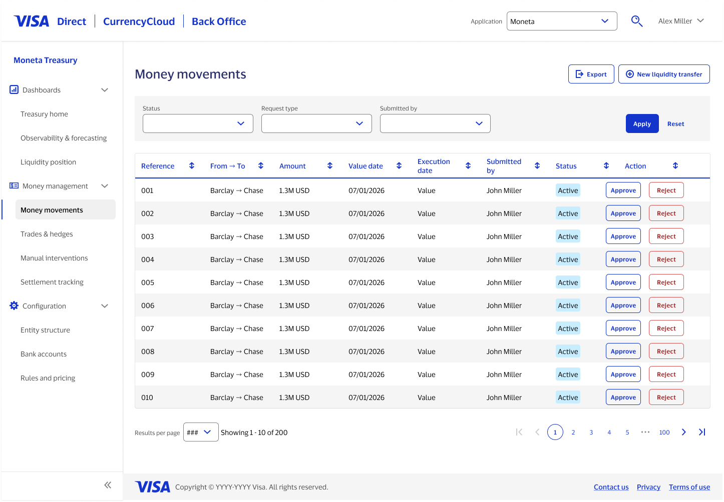
When my team was approached with this project, stakeholders gave us an AI-generated prototype, with the expectation that we'd polish them return designs with minimal structural change. However, with more than 10 product owners each responsible for different modules, there were significant differences in mental model and terminology surfacing in the designs. Related concepts were separated across screens; key data might signal that action was needed, but completing it required a jump to a distant part of the platform.
To get familiar with the landscape, I performed a comprehensive information architecture review. It showed that visual design alone could not resolve the information-architecture and product-definition problems underneath it.
02
Expanding the scope before polishing screens
I raised the structural concerns with the design team, then walked the product team through why we needed to resolve them before detailed screen design continued. The team made room for deeper exploration and definition.
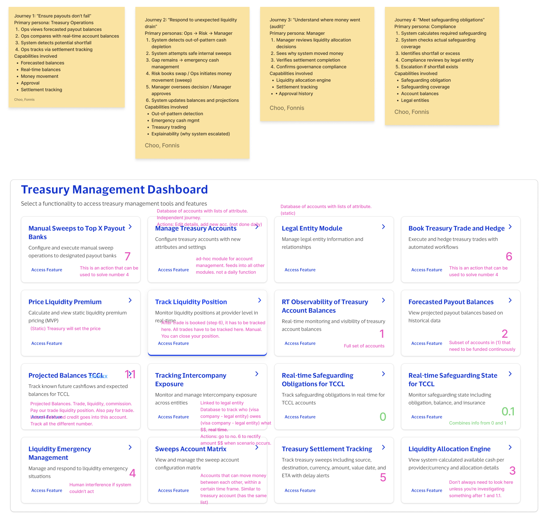
That decision changed the work from a screen-polishing exercise into a product-definition effort. Ambiguous labels were signals of deeper issues: overlapping concepts, unclear capability boundaries, and no shared view of how users completed critical work from beginning to end.
In complex domains, language is architecture: labels define boundaries, hierarchy expresses a mental model, and journeys connect system capabilities to human intent.
03
Organizing the product around real journeys
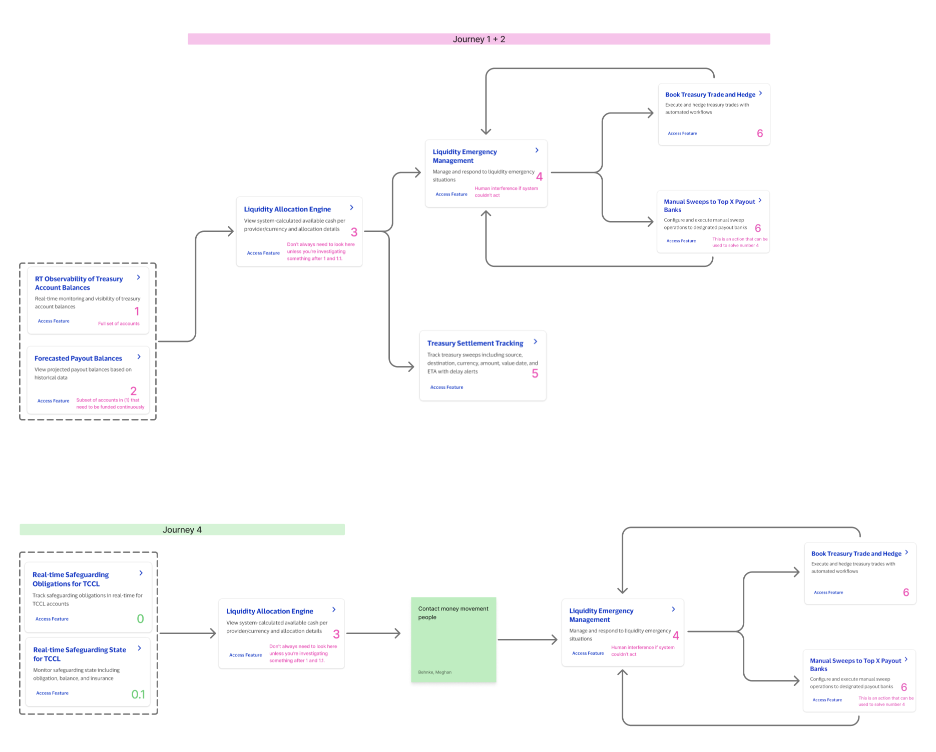
Through collaborative working sessions, I helped reorganize the capabilities around four recurring journeys: preventing payout failures, responding to an unexpected liquidity drain, auditing where money moved, and meeting safeguarding obligations.
That shift changed the conversation. Instead of asking where each owner’s feature belonged, we asked what a user needed to understand and do from start to finish. Mapping the journeys made gaps and overlaps visible across the organization.
04
From hypothesis to testable product structure
The team translated that shared understanding into an information-architecture hypothesis with four zones: current health, safeguarding and risk, managing and moving money, and lower-frequency configuration.
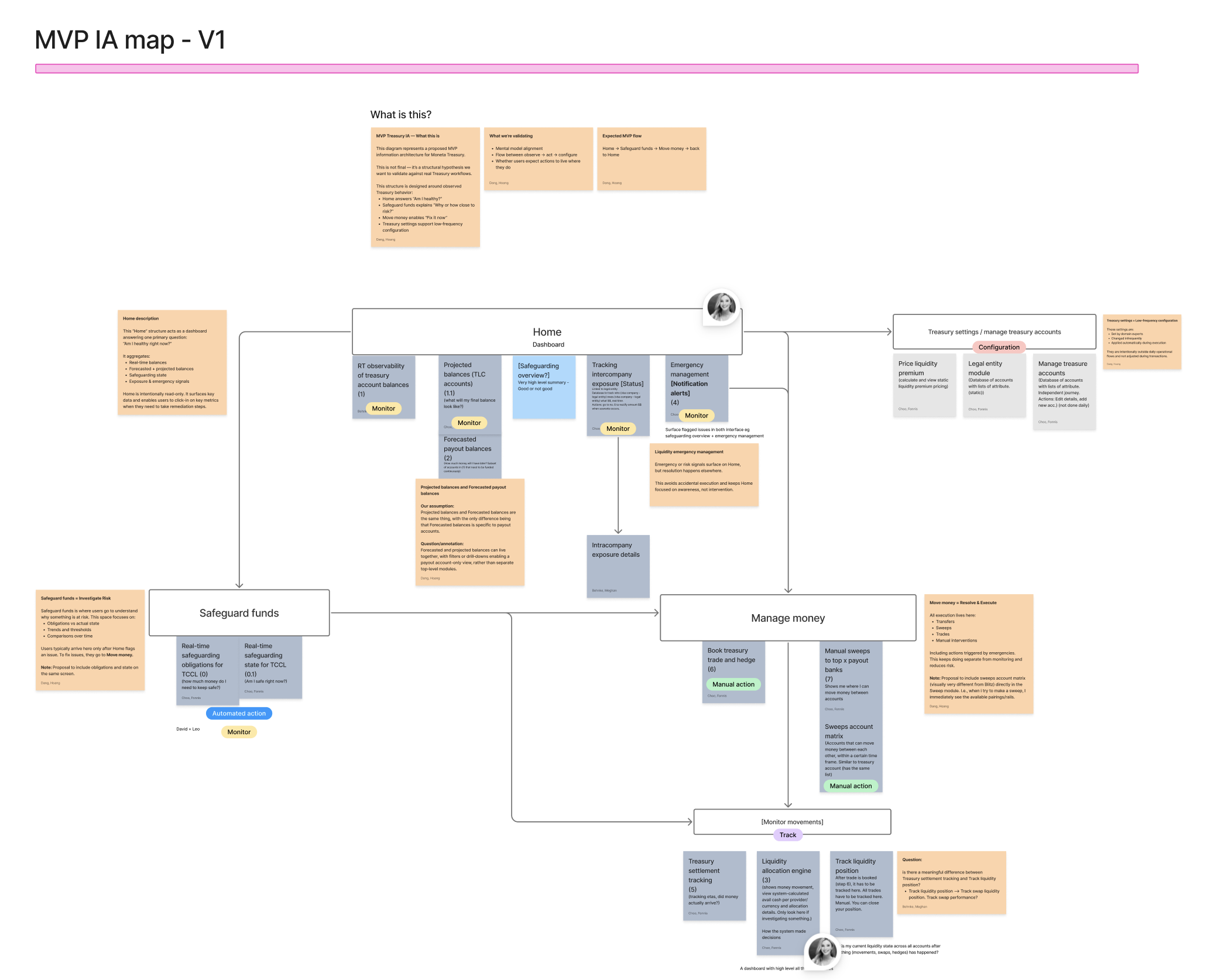
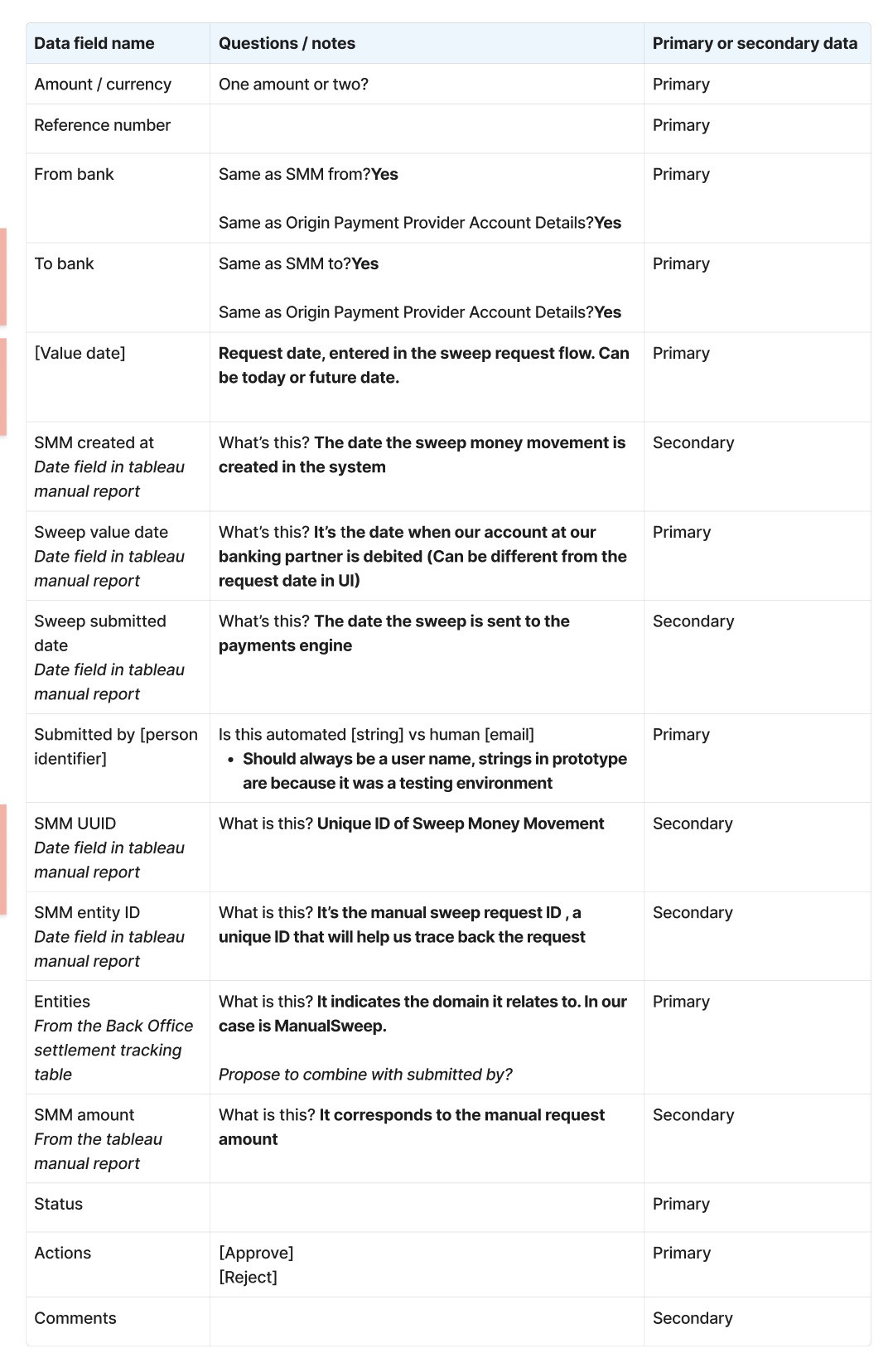
The architecture also needed to account for the volume of financial data users relied on to make decisions. Some information needed to stay visible throughout their work; other details were less critical but still needed to be easy to access. I mapped the key data fields and distinguished primary information, needed for continuous reference, from secondary information users could reach by drilling into a record.
That mapping required us to establish what each field actually meant. The same data sometimes appeared under different names in different tables, making it look like separate information. For one money-movement table, I documented the fields, worked through naming overlaps and unclear definitions, and identified which belonged in the primary view versus a deeper level. This gave us a clearer basis for deciding what users needed in front of them and what could remain one level away.
05
Building and refining the modules together
With the information architecture in place, we began building out individual modules with AI-assisted tools. Rapid prototyping gave us concrete screens to work through with the stakeholders responsible for each area. In working sessions, we asked questions, annotated unresolved details, and clarified how the designs needed to support treasury work.
The prototype below shows that process in progress: notes question status labels, distinguish manual from automated flows, and call out missing audit-trail information. These discussions helped us refine the behavior and content together before carrying the decisions into polished designs.
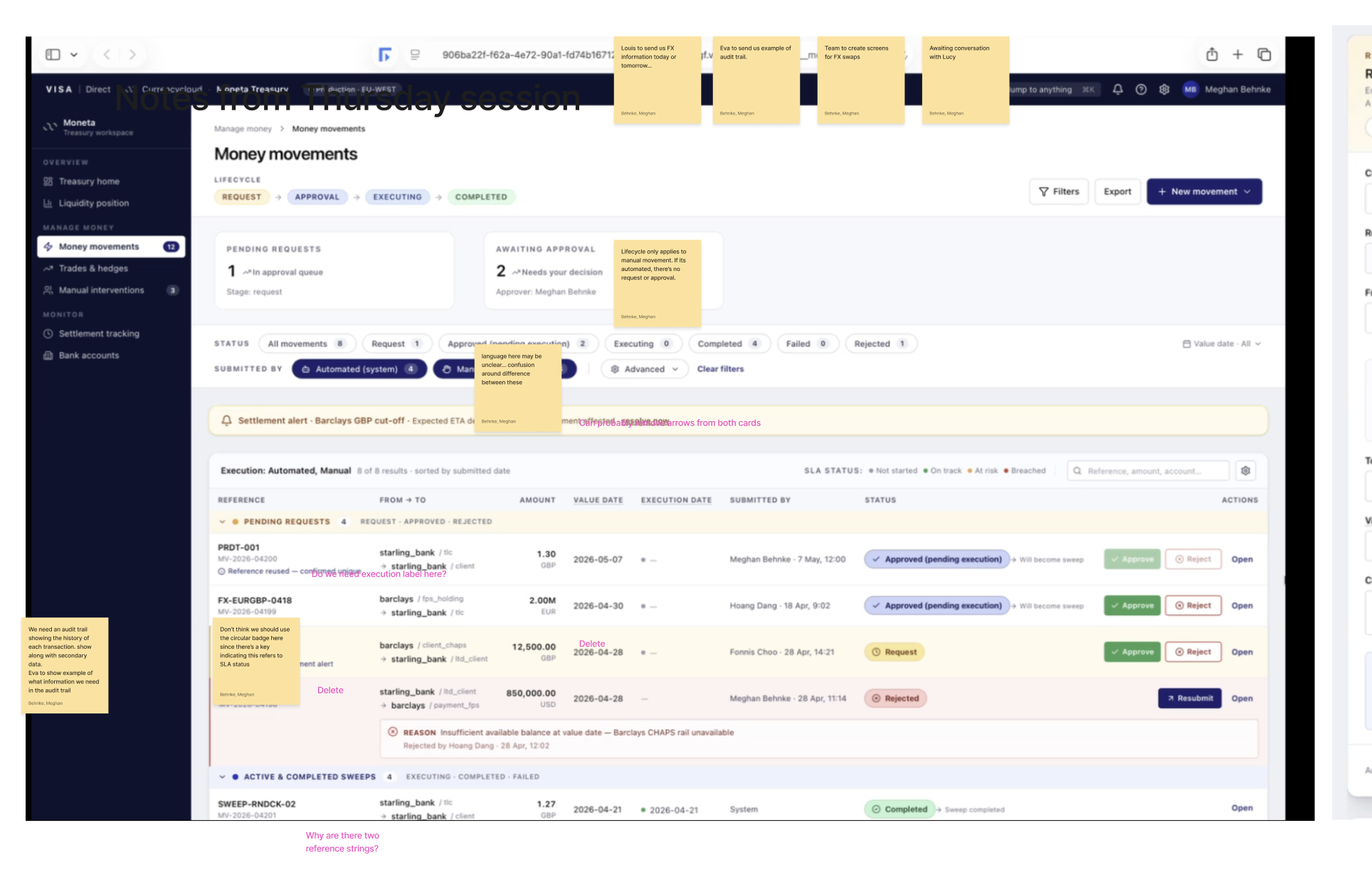
The shared product model gave us a basis for refining each module. Screens could be evaluated against agreed user goals and connected workflows, rather than as isolated features. From there, the designers moved from Replit to Figma to translate designs into Visa's design system.
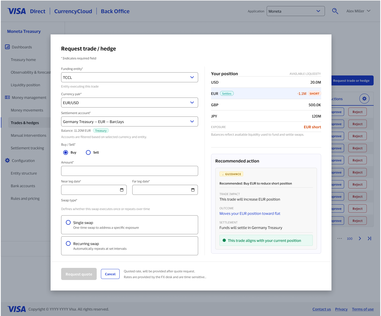
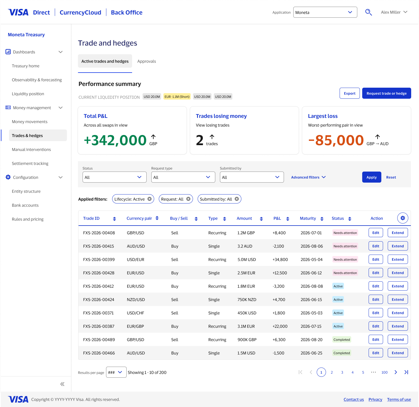
Moneta reinforced my belief that content design has its greatest influence before there is interface content to write. Here, defining a term meant establishing what a field represented, how it related to other data, and where it belonged in a workflow. Those decisions connected the expertise of product owners to the structures we designed and the actions users would take.
My contribution was helping the team reach that shared understanding and carry it from architecture into individual modules. The value extended beyond clearer labels: we had a common basis for discussing requirements, resolving conflicting assumptions, and making design decisions across a complex treasury platform.